Popup
Popups are great for contextual content, interaction and controls that live relative to the map. A popup can be implemented on your ol-kit <Map> with a single-line drop-in.
Prebuilt, Ready to Go
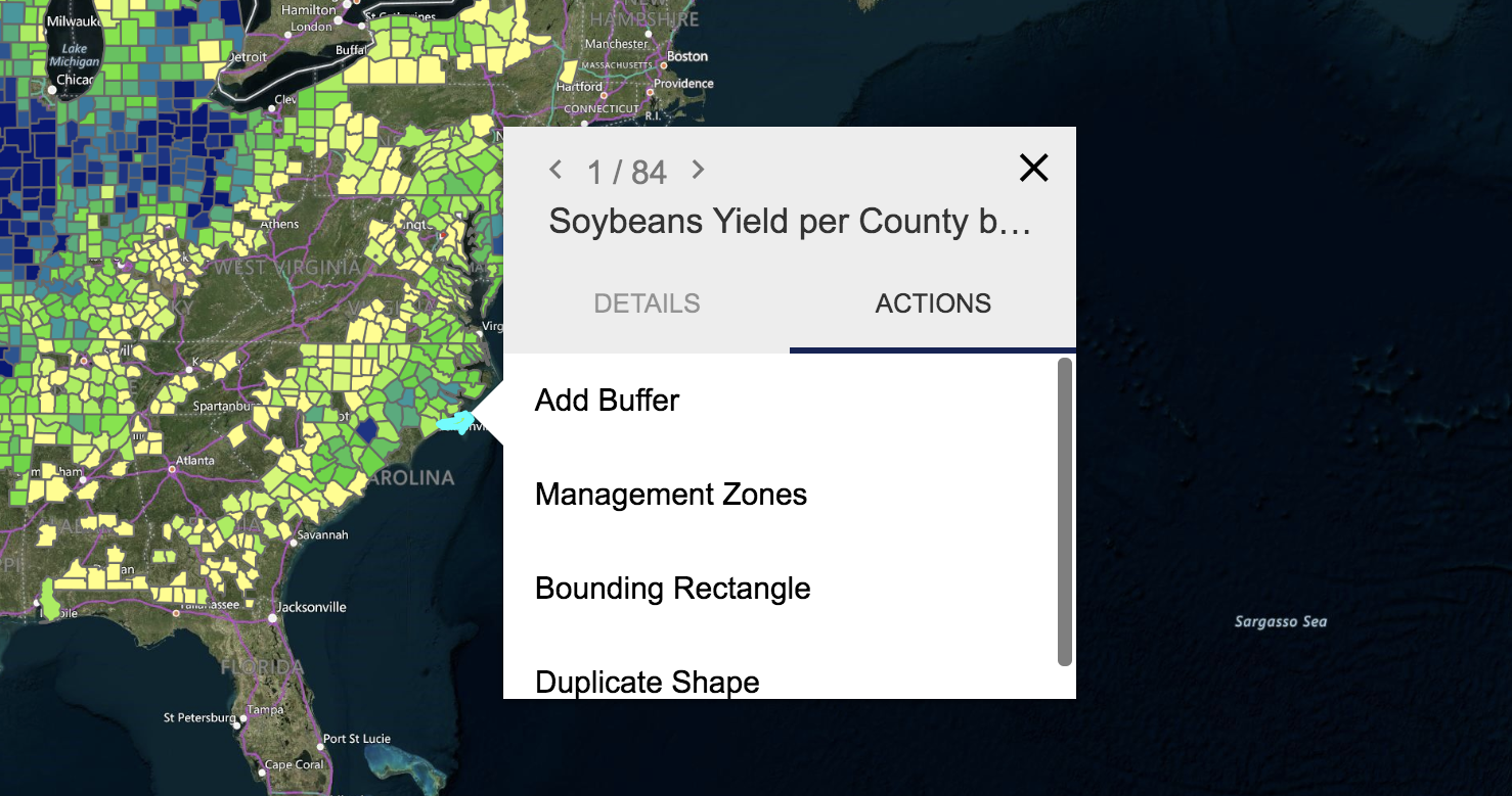
Since components exported from ol-kit already have a reference to the map (see connectToContext), you can have a slick popup experience out of the box. When a feature or features are clicked, the popup snaps to the edge of the feature(s)' bounding box. It also repositions itself on drag to an area of best-fit based on the edge of the viewport and other components on the map. This all works without requiring a single prop!
import React from 'react'
import { Map, Popup } from '@bayer/ol-kit'

const App = () => {
  return (
    <Map>
      <Popup />
    </Map>
  )
}

export default App
That will look something like this (minus the data layer):
Customize
What you're seeing is the default popup with a PopupDefaultInsert as its child. To pass different children to the popup or create custom functionality checkout the docs for popup.